Mastering the Art of Design-1st Principle: Balance
- Maria Oikonomopoulou

- Oct 31, 2023
- 4 min read
Updated: Nov 4, 2023
Balance in design is a fundamental principle that lies at the heart of creating visually appealing and effective compositions. In this article, we will explore its various forms, its importance, and how it can be utilized to convey different messages.
What is balance and why it is important
Balance is about achieving a sense of equilibrium where each individual element adds to the overall composition. While certain elements may serve as focal points and capture your attention, none of them overpower the composition to the extent that you lose sight of the other elements. A well-balanced composition exudes a sense of stability and visual appeal.
In the physical realm, balance is a concept we intuitively grasp, as it's a phenomenon we encounter regularly. When an object lacks balance, it typically has a tendency to fall over. Thus, an unbalanced composition in design might lead to tension. On the other hand, balancing a design ensures that the various points of interest within your composition receive equal attention from the viewers. This, in turn, allows all the information you wish to convey to be thoroughly absorbed.
Types of Balance
There is often the misconception that achieving balance in a design requires symmetry in all aspects. However, there are actually 4 types of Balance: Symmetrical, Asymmetrical, Radial, and Mosaic.
1. Symmetrical Balance
Symmetrical balance (formal balance), is characterized by the equal distribution of visual elements on either side of an imaginary central axis. It can be thought of as a 50/50 balance or a reflection of one side mirroring the other. This form of balance results in a stable arrangement that can convey a sense of order and formality in various design contexts. On the downside, it can be perceived as static and uninteresting. Since one half of the composition mirrors the other, a significant portion of the design becomes easily anticipated, potentially diminishing visual excitement.

Below are some examples of McDonald's ads that use symmetrical balance. The images are placed in the center and the visual weight is equally distributed. What about the McDonald's logo, can you notice that it is symmetrical?


Ads by Mc Donalds, left to right: 1st Image agency: Cossette, Canada, 2nd image agency: DDB, 3rd image: Lego-Mc Donalds ad
Let's check another concept ad for Kit Kat. It encourages the viewer to pause the responsibilities and take a break with 2 slices of the product shaping the famous pause button. The photo looks symmetrically balanced.

Concept Ad for Kit Kat, no rights reserved
2. Asymmetrical Balance
Asymmetrical balance is achieved when there is an unequal distribution of visual weight on either side of the composition. In an asymmetrical balance, you might find two subjects in different areas, with neither subject grabbing all the attention. Alternatively, one side can have the main subject, which is counterbalanced by several smaller elements on the opposing side. This form of balance is dynamic and captivating, evoking a sense of modernity, motion, and energy.

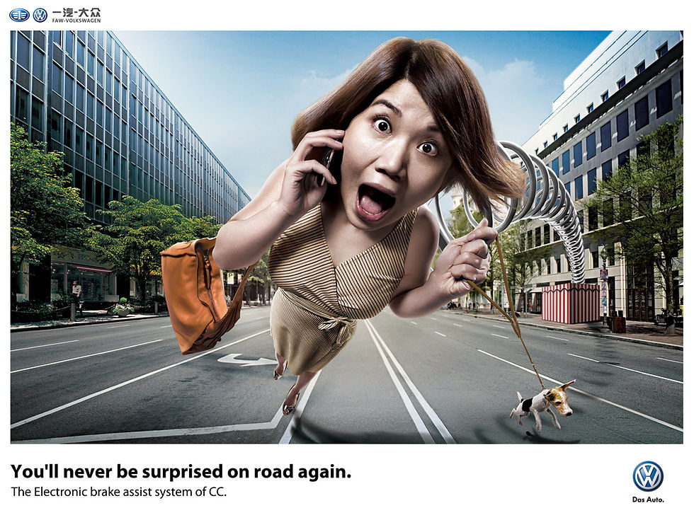
Check the ad below by Mercedes. We see the car and the building that have high visual weight on the right part while the black box with the text and multiple small buildings appear on the left part of the image, resulting to an asymmetrical balance.

Ad by Mercendes
In this ad by Adidas, the main object leans towards the left while the text ''Impossible is nothing'' and the logos are on the right side to create a sense of balance.

Ad by Adidas, agency: 180/TBWA, China
3. Radial Balance
In Radial Balance visual elements radiate outward from a central point, creating a sense of equilibrium and harmony in a composition. It's like having a central point with elements arranged in a circular pattern around it. This style makes a design feel organized and draws your eye to the center.

Graphic designers often employ radial balance in logo design to swiftly and efficiently convey a message within a compact layout. In our example, the logos of Target, Mercendez, and Yamaha have a radial balance. As everything extends outward from the central point, it naturally converges back to that center, making it a prominent focal point of attraction. These logos are symmetrical no matter how or how much you rotate them.

4. Mosaic Balance
Mosaic balance, also known as crystallographic balance, emerges from an intriguing equilibrium within apparent chaos. In this type of composition, there are no clear focal points, and all elements receive equal emphasis, resulting in an initial impression of visual complexity. Surprisingly, this seemingly chaotic arrangement ultimately combines to create a harmonious whole.

In the image below there is no clear focal point but the result somehow looks balanced.

In conclusion, the principle of Balance is a crucial aspect of a design. Whether it's the serene symmetry of formal balance, the dynamic energy of asymmetry, the captivating complexity of mosaic balance, or the radial allure of balance around a central point, each type offers a unique palette for creative expression.
As you explore the world of design, the mastery of balance will empower you to craft messages that resonate with clarity and elegance. It will guide your artistic endeavors, ensuring that no element overshadows the rest and that every visual story unfolds harmoniously.
Comments